|
My production skills have developed throughout this project in all ways. Before this project, I had some experience and practice with production, but it was very minimal. For the most part, I understood what effect the changes I made would have on my project's appearance, but no understanding of how they affected how people would view my project. Although, my production skills still did increase dramatically in both manners. Now I know how different things can be utilized to help grab peoples' attention better and keep them reading, which I had near no understanding of beforehand.
0 Comments
1.) The editor can completely shift a film's perspective.
2.) Editing can be used to impact what emotions are evoked by certain scenes and the entire film. 3.) Editing can open up new ideas and possibilities for the film and how it plays out. how does your product engage with audiences
My product/magazine cover engages with audiences by using a few things. One is that my magazine cover has big, bold title letters to help it attract the attention of potential readers by making it hard to miss. It also has a picture of a delectable looking salad to further entice the audience and make them interested about the contents of the magazine. The picture also serves the purpose of painting the picture for what the magazine contains and what it's articles discuss. Finally, the cover lines give the readers a taste of the kind of articles the magazine sports. how does your product be distributed as a real media text My product/magazine cover would be distributed as a real media text mostly via the internet. Although there would be some paper copies made and distributed to the public, it would mostly be distributed and updated online. This is due to the fact that the majority of magazines and articles are read online nowadays. My product would be marketed via mostly social media platforms like twitter, instagram, and facebook. These platforms are where most people get most of their information from. This makes utilizing them not only useful for marketing my product, but also for the distribution of it My product/magazine cover matches the conventions used in most modern magazine covers. The picture used on the cover displays an appealing looking salad that has many health benefits. This helps to paint the picture for the reader of what the contents of the magazine are. The cover lines help to further introduce the contents of the magazine by giving the reader a few of the titles of the articles inside the magazine. Finally, the title of the magazine is big and in bold letters, similar to that of most magazines. This grabs the readers attention and makes it seem as though the magazine is fun and interesting.
My product/magazine cover represents social groups or issues by helping demonstrate how people can eat healthier. One of the most, if not the most common health issues in America today are obesity and high blood pressure. My magazine/magazine cover gives easy ways to eat and make healthier choices for your diet overall. One of the biggest problems people have when transitioning from an unhealthy diet to a healthy one is the flavor. This is because unhealthier foods tend to have better and more addictive tastes. My product gives good tasting and healthy recipes, and also provides healthier alternatives to certain aspects of obese diets. The issues raised by media ownership spread vast and wide. Every part of media is owned by a large company that completely controls how it is viewed by the public. They reserve the individual right to make, advertise, release, and profit off of the media they own. This gives these conglomerates the ability to essentially control the narrative of society through the many media outlets they own.
Big conglomerates, or parent companies, have almost complete control over how the general public views media and certain aspects of society. A good example of a conglomerate that is very dominant is the industry is Disney. Disney owns an unbelievable amount of the media that is distributed and circulated throughout the world. Due to their right to completely control the media they own, they can sway people's bias's to be more in line with their own through the connotations given to and way they display certain things. The ownership of media by large companies also means that they control where funding goes in this industry. This gives them even more power and dictation over what is seen by people. This causes the dilution of diversity in the industry because smaller independent film studios get swallowed up and taken over by these conglomerates. This makes it so the same messages and ideas are spat out time and time again by the same companies. Their ideas and opinions are often the only ones seen due to the lack of competition in the space. The introduction of new technology year after year makes it even easier for companies like Disney to control the narrative. Advancements in technology make it easier than ever to make the messages and biases given through film and writing more acceptable and believable. Due to the fact that technology is everywhere nowadays, there is no escape from the attempts to dictate how people feel about certain things. Especially since a decent majority of people today will believe what they see online without a second thought. Media ownership can completely influence how people view political topics like elections. Companies like Fox News may only show the good aspects of one candidate and the negative aspects of another. Or, maybe they won't give one candidate any screen time at all. This is done to help support the interests of themselves or their parent company. It is also possible that this is done to please substantial investors who might benefit from win or loss of a candidate. 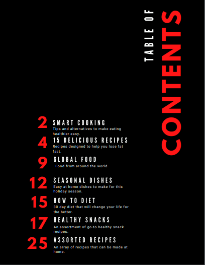
Link to Canva editing page below.
https://www.canva.com/design/DAEMx2AeicU/kBVqUSRz8X0TNLs5848Hxg/edit?layoutQuery=Table+Of+Contents
Compulsory Questions
My magazine cover and TOC do not challenge the normal or go beyond it. They are both pretty normal and aren't entirely different or unique relative to the average magazine. My product doesn't really represent any big social groups or issues. The only thing that comes to mind teaching people how to eat healthy. So in a way, it relates to the obesity problem in America and working to help solve it.
I think that my magazine cover does appeal to my target audience. The target audience for a magazine like this would be people who want to eat healthier and be healthier. There is a picture of a salad on the cover, which is pretty upfront when it comes to letting people know what is in the magazine. Although, I feel like i could have chosen a better name for the magazine since the current one is pretty vague. The magazine would be mostly digital because thats how most people read magazines and articles nowadays.  I chose this TOC layout because it clearly shows you what to expect on each page. It doesn't just give some boring text labeling each page for what is on it, this TOC also shows a picture representing each page. This does not match my front page concept. 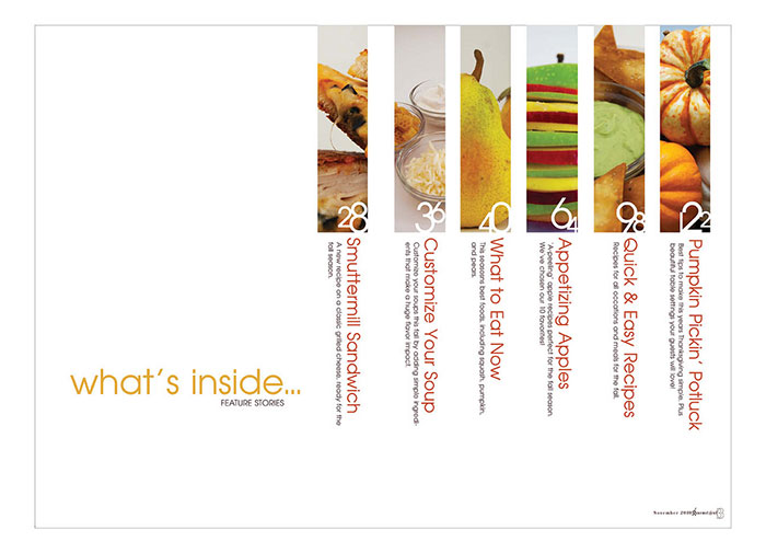 I chose this TOC layout because it is simple and straight to the point. The simplicity looks good and clearly directs readers to whatever they are looking for. I also like how there is a small description for each article so readers know what they are getting into before they read an entire article. This could match my front page concept. 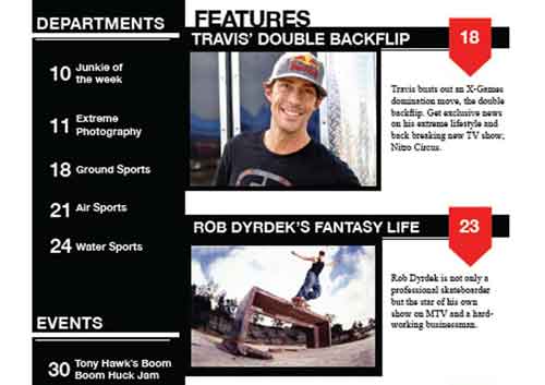 I chose this TOC layout because of a couple of reasons. For one, there is no beating around the bush for this layout. It is straight to the point and lets readers know where to go. The other reason is that it shows the exciting featured articles upfront along with a description. This does not match my front page concept. Some possible article topics for my front page concept are articles about new diets, healthy recipes, unhealthy recipes, new restaurants and their menu, reviews of restaurants and their menus, and seasonal dishes to make at home.
NotesFor the notes on the Fargo clip I didn't actually feel the need to take any. I also didn't have any need to re-watch the clip. This is probably because I have watched that whole episode twice before the assignment and remembered it well. Seeing as there are no notes to compare to the example, I cannot do any comparing or contrasting for that matter. ResponseFor my response, I answered with sectioned off little paragraphs and talked about each topic for the scene relatively fluently. Whereas the candidate started with sectioned off bullet points for each topic of the clip and then moved into an essay format as he walked through the clip and analyzed things as they went. I did not analyze the coloring and lighting like the candidate did, but both the candidate and I mentioned the sound to be a major thing. While the candidate sees the murder as being more sudden and out of nowhere, I thought it was more so suspicious from the beginning and it was almost somewhat obvious that some big event was going to take place. It was similar to how in a horror movie, you often know a jump-scare is going to take place due to something like a lack of audio, or some other method of building up suspense.
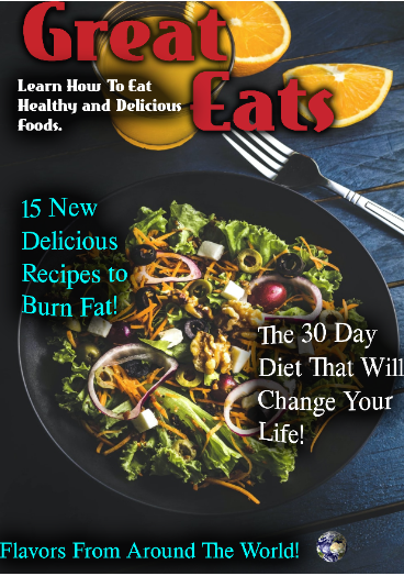 Title/masthead: The title of my magazine cover is Great Eats and it literally means good food. It suggests that in the magazine there will be articles about good food, whether it be healthy food or dessert food.
Typography: The attitude suggested by the text is happy and upbeat. Image: The image selected for the cover is of a salad on a dark blue table. The image is darkly lit and the camera angle is taken from above the salad. Definition: The relationship between texts, especially literary ones. The three types of intertextuality are obligatory, optional, and accidental. Obligatory: When the writer invokes a comparison or association between two texts or more on purpose. Optional: It is possible to either find a connection between two or more texts, or find no connection at all. Accidental: When readers can find a connection between two or more texts without any tangible anchorpoint within the original text. Picture examples of intertextuality below:
|
Kyle ThompsonI'm 16, I go to Monarch High School. Archives
April 2021
Categories |
 RSS Feed
