|
To access my final critical reflection presentation, click the file below. To access the voiceover, click the volume icon in the presentation.
How does your product use or challenge conventions and how does it represent social groups or issues? My product matches the conventions used in most modern magazines. The picture used on the cover displays an appealing looking salad that has many health benefits. This helps to paint the picture for the reader of what the contents of the magazine are. The cover lines help to further introduce the contents of the magazine by giving the reader a few of the titles of the articles inside the magazine. The title of the magazine is big and in bold letters, like that of most magazines. This grabs the reader’s attention and makes it seem as though the magazine is fun and interesting. The magazine’s topic in general is also nothing new or unique when compared to many other magazines. Healthy food magazines have been around for years but are rising in popularity over recent years due to increased awareness about the benefits of eating healthier. My magazine fits perfectly in line with this idea because it teaches people how to eat healthier and what can be gained by doing so. My product represents social groups or issues by helping demonstrate how people can eat healthier. One of the most, if not the most common health issues in America today are obesity and high blood pressure. My magazine gives easy ways to eat and make healthier choices for your diet overall. One of the biggest problems people have when transitioning from an unhealthy diet to a healthy one is the flavor. This is because unhealthier foods tend to have better and more addictive tastes. My product gives good tasting and healthy recipes and provides healthier alternatives to certain aspects of obese diets. How does your product engage with audiences and how would it be distributed as a real media text? My product engages with audiences by using a few things. One is that my magazine cover has big, bold title letters to help it attract the attention of potential readers by making it hard to miss. It also has a picture of a delectable looking salad to further entice the audience and make them interested about the contents of the magazine. The picture also serves the purpose of painting the picture for what the magazine contains and what its articles discuss. Finally, the cover lines give the readers a taste of the kind of articles the magazine sports. My product would be distributed as a real media text mostly via the internet. Although there would be some paper copies made and distributed to the public, it would mostly be distributed and updated online. This is due to the fact that most magazines and articles are read online nowadays. My product would be marketed via mostly social media platforms like twitter, Instagram, and Facebook. These platforms are where most people get most of their information from. This makes utilizing them not only useful for marketing my product, but also for the distribution of it. How did your production skills develop throughout this project? My production skills have developed throughout this project in all ways. Before this project, I had some experience and practice with production, but it was very minimal. For the most part, I understood what effect the changes I made would have on my project's appearance, but no understanding of how they affected how people would view my project. Although, my production skills still did increase dramatically in both manners. Now I know how different things can be utilized to help grab peoples' attention better and keep them reading, which I had near no understanding of beforehand. How did you integrate technologies – software, hardware and online – in this project? I integrated technologies in this project by designing and editing it entirely online. In terms of software, I used the websites like Photopea and Canva to design and construct the entire magazine. I also used the internet to research other magazines for inspiration on how I could design my own. The way I integrated hardware in this project is mostly very simple and self-explanatory. I integrated hardware by using my computer and all the things the go with it, like a mouse and keyboard to design this project.
0 Comments
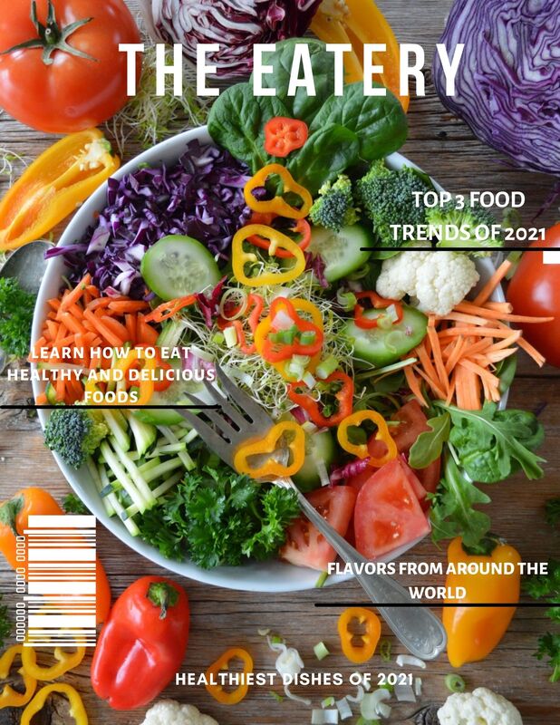 The process to completing my magazine cover was the most tedious. The original, revised and completed cover all have different looks. After viewing each cover it would reveal new errors and issues that needed to be changed. Issues such as, color contrast, fonts, sizing, cover images and cover lines. In my original cover that colors and fonts did not go well together and made the appearance of the cover messy. The color contrast in my revised magazine made it very difficult to read the cover lines and the fonts were basic. Also, my original and revised were both missing a barcode. This lead to the complete new look of my magazine cover, many components were changed to fit the ideal look. New fonts, cover images, cover lines and a barcode were all used to achieve the final magazine cover.
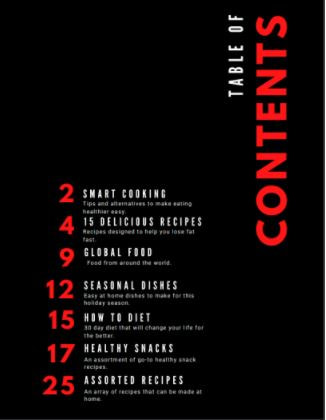 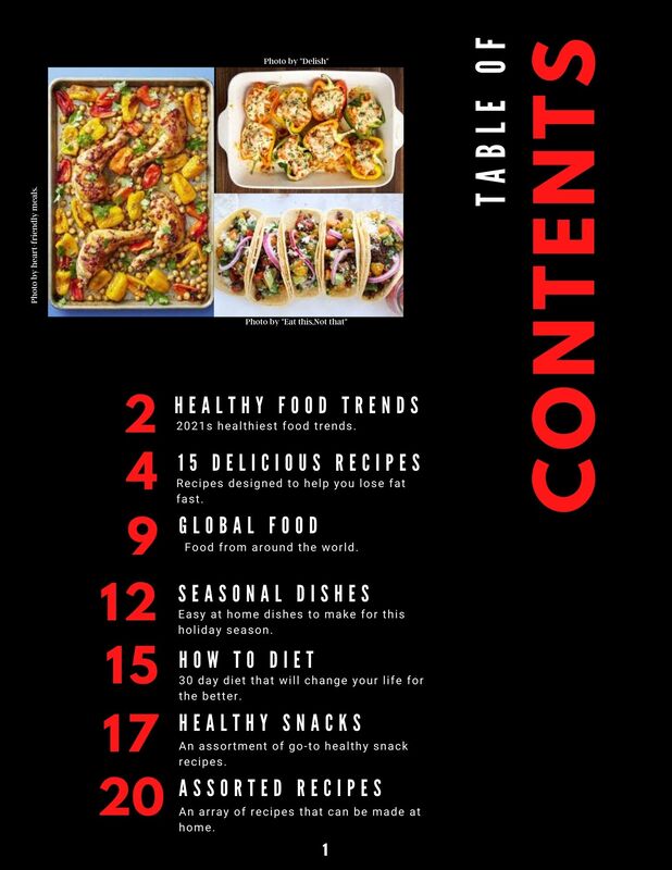 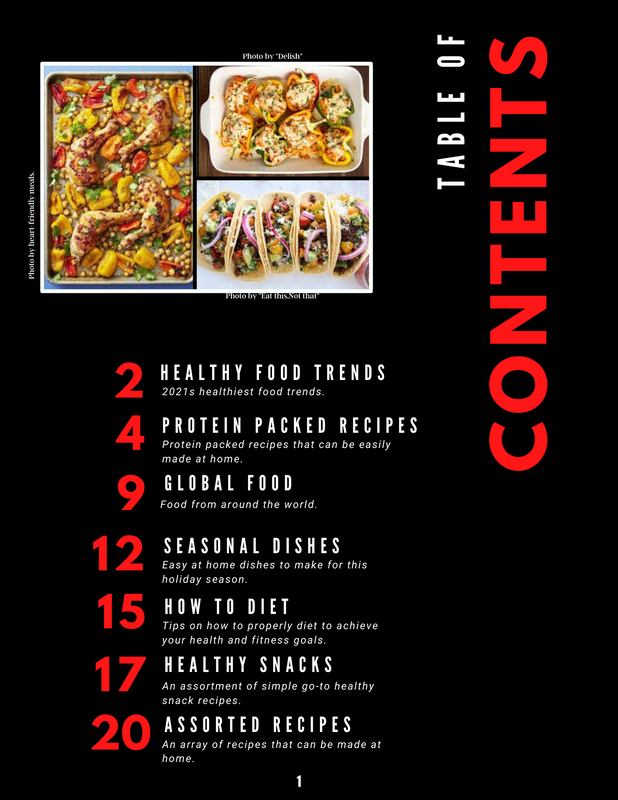 The table of contents above are in order from first to last (top to bottom). From the first to the second one, I added some pictures to help further entice the reader and give them a better idea of what to expect throughout the magazine. I also updated the articles based on what I thought would fit and suit the overall theme and idea of the magazine better. Finally, I made some small changes to the font sizes of the text to make it appear better. From the second to the final edition I didn't change too much. Again, I changed some of the articles to ones that better suited the magazine and that I was more knowledgeable on. I added the italics font effect to all the descriptions of the articles simply because I thought it looked better. I added borders to the pictures to help them pop and stand out more. While this change may not be very noticeable, I also adjusted the positions of all the text to better line up.
Viewing the news can have a major impact on the way we think and behave. People in general are more likely to view news covering negative topics like terrorist attacks or natural disasters. Due to this, media outlets are a lot more likely to make news that covers these more negative and pessimistic topics. All of the exposure people have to these negative sources of news can often lead to a lot of fear and misinformation among the general public. This can affect the way people live and approach life as a whole, usually with a more pessimistic and negative outlook.
I completely agree that the news changes the way we think and behave. In modern society, the news is almost inescapable and gets shared to almost everyone one way or another. At this point, it's probably less likely that the news doesn't have an impact on the way somebody thinks or behaves. As said in the article, people are a lot more likely to be interested in news covering negative topics rather than ones with a more optimistic view. And if we all spend a large portion of our day just soaking in all this negative information, it's bound to impact the way we think and behave. Generally for the worse because the news instills a pessimistic outlook into the vast majority of its viewers. This is my completed final double page spread. Throughout the process of creating the pages, I only encountered a few errors. This process was easier than the others because I was more comfortable with the software and how to navigate through it. The only components I added was the photo credits and page numbering. 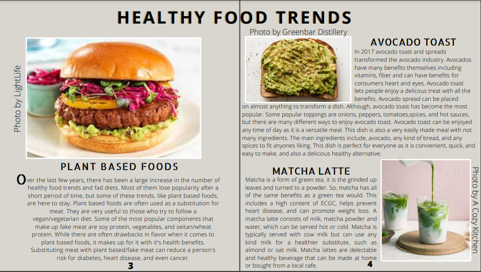 What significance does the continuing development of digital media technology have for media institutions and audiences?
The continuing development of digital media technology has a very large impact on media institutions and audiences. One of the reasons it is significant for media institutions is that it makes marketing their product much easier. With the rise of social media and overall increased use of technology, a film company would have no problem making the majority of our country aware of the impending release of their film. The developement of technologies like 3D/4D and HD has also had an impact. These technologies make viewing a film at a theatre a much more in-depth and immersive experience for audiences, which gives people a good reason to go out to view a film instead of waiting for it to release for at-home viewing. This also makes it a lot more difficult for smaller film companies to compete at theatres, because they often don't have the funds required to give their audience the same quality experience that films with a bigger budget can. On the flip side, the continued developement of online viewing and at-home streaming services like Netflix and Hulu has given audiences a better reason than ever to stay home to view films. It is much cheaper, more convenient, and an overall more comfortable viewing experience than what is provided at theatres. The also impacts the producers of these films because the increased ease of watching films has in-turn increased the amount of stuff people watch. I have had many experiences of media consumption with video games, and the majority of them accurately reflect wider patterns and trends in audience behaviour. One of the ways I experience media consumption with video games is the device I use to access and play the games. The exact model or brand I use is irrelevant here, but what is relevant is the price of these devices. As technology continues to develope and companies begin to use these newer technologies, it costs more and more to make these devices. Which in turn, makes them more and more expensive for their players/audience to buy. The high prices of the new generation of gaming consoles is the reason I personally won't be buying any of them any time soon. The same applies to all the other people who don't want to, or can't, spend so much on any of the newer devices
I integrated technologies in this project by designing and editing it entirely online. In terms of software, I used the websites like Photopea and Canva to design and construct the entire magazine. I also used the internet to research other magazines for inspiration on how I could design my own. The way I integrated hardware in this project is mostly very simple and self-explanatory. I integrated hardware by using my computer and all the things the go with it, like a mouse and keyboard to design this project.
1-Setting: Setting is an essential element to Mise en Scene because for one, it is everything the audience sees that has to do with the time and place of a film aside from the costumes. Setting can also help depict the personality and other traits of characters from the film based upon what setting is associated with a certain character.
2-Decor: Decor is an essential element to Mise en Scene because it can help express the feeling that the film is intended to give off. Decor can also be used to help express the feelings and personality of certain chararcters. 3-Lighting: Lighting is an essential element to Mise en Scene because it can help create the mood that the film is intended to give off. Certain kinds of lighting are also only suitable for certain movie genres and scenes. If a horror movie had very bright lighting, it wouldn't create the right feeling and would take away from the feeling that genres is supposed to give its audience. 4-Depth Of Space: Depth of space is an essential element to Mise en Scene because it can be used to keep the viewers eyes focused where ever they want them to be. A good example of a use for this is in horror movies. While the viewers eyes are trained on the people talking on screen, something mysterious darts past the screen in the background. Nobody was really paying attention to that thing, but everybody watching still notices it, which creates a sense of eerieness. 5-Costumes and Makeup: Costumes and makeup are an essential element to Mise en Scene because they can help paint the picture of what a character is like. If a character was wearing very vibrant and lively colors, it would give off the feeling that they are a very happy and optimistic character This is my revised magazine cover. I changed the masthead, cover image, fonts, and the overall style of the magazine. The original cover appear messy from the different fonts and colors, so in my revision I changed those components. The fonts and colors now fit the simplistic look i was originally going for.  This is my original magazine cover, the fonts, color and style did not match the overall look I was going for. The colors of the text did not match each other or the cover image. 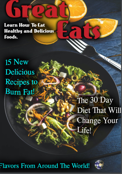 |
Kyle ThompsonI'm 16, I go to Monarch High School. Archives
April 2021
Categories |
||
 RSS Feed
